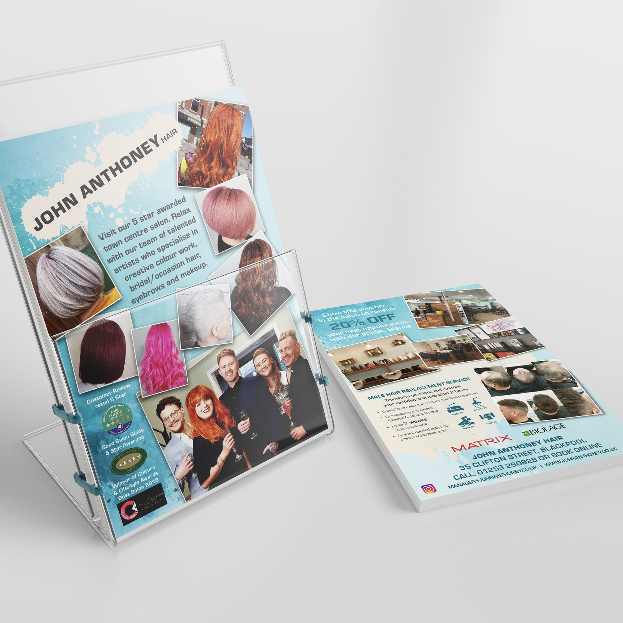
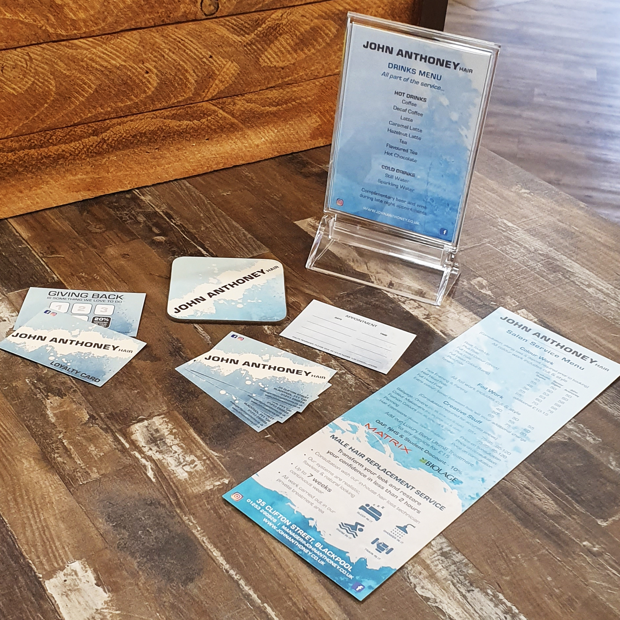
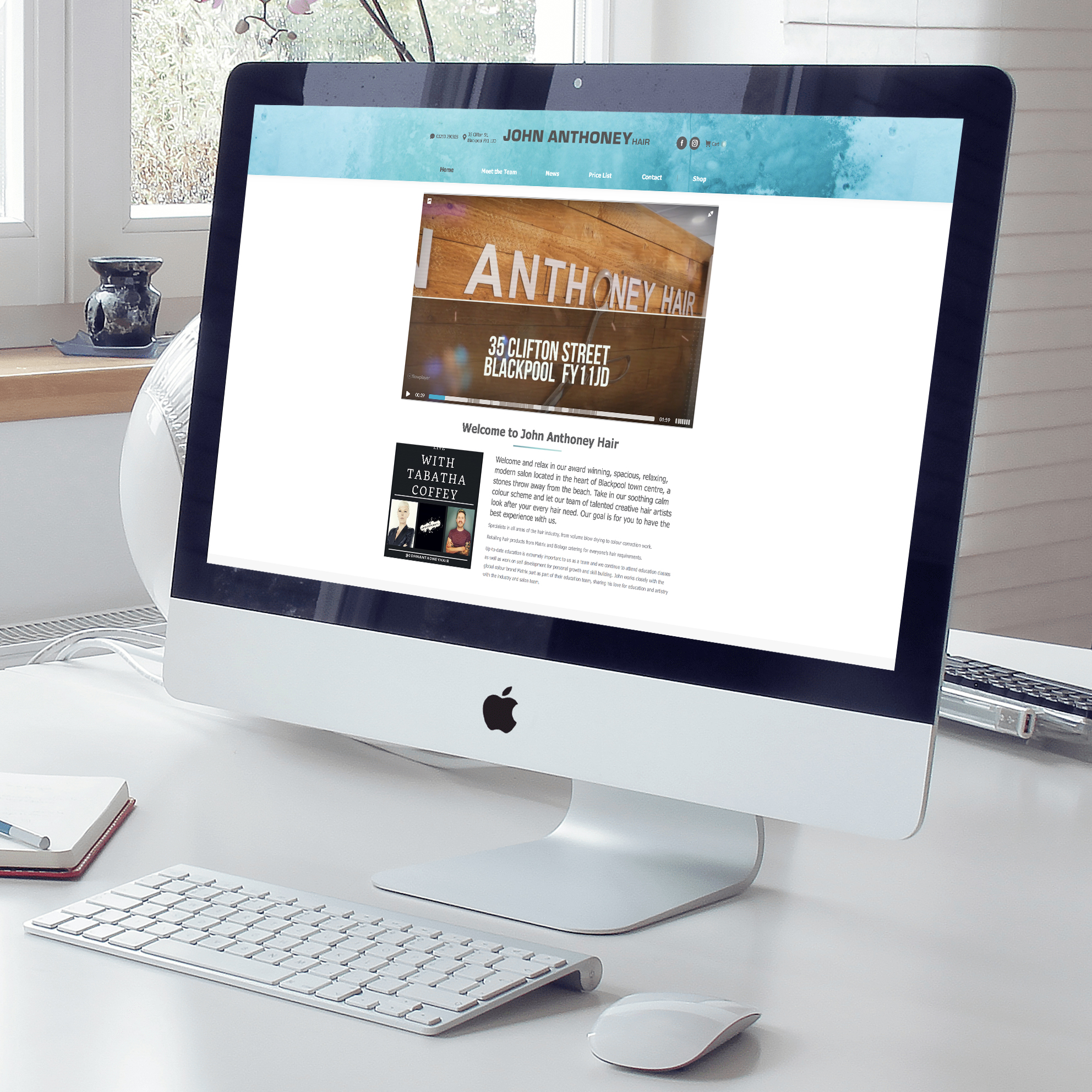
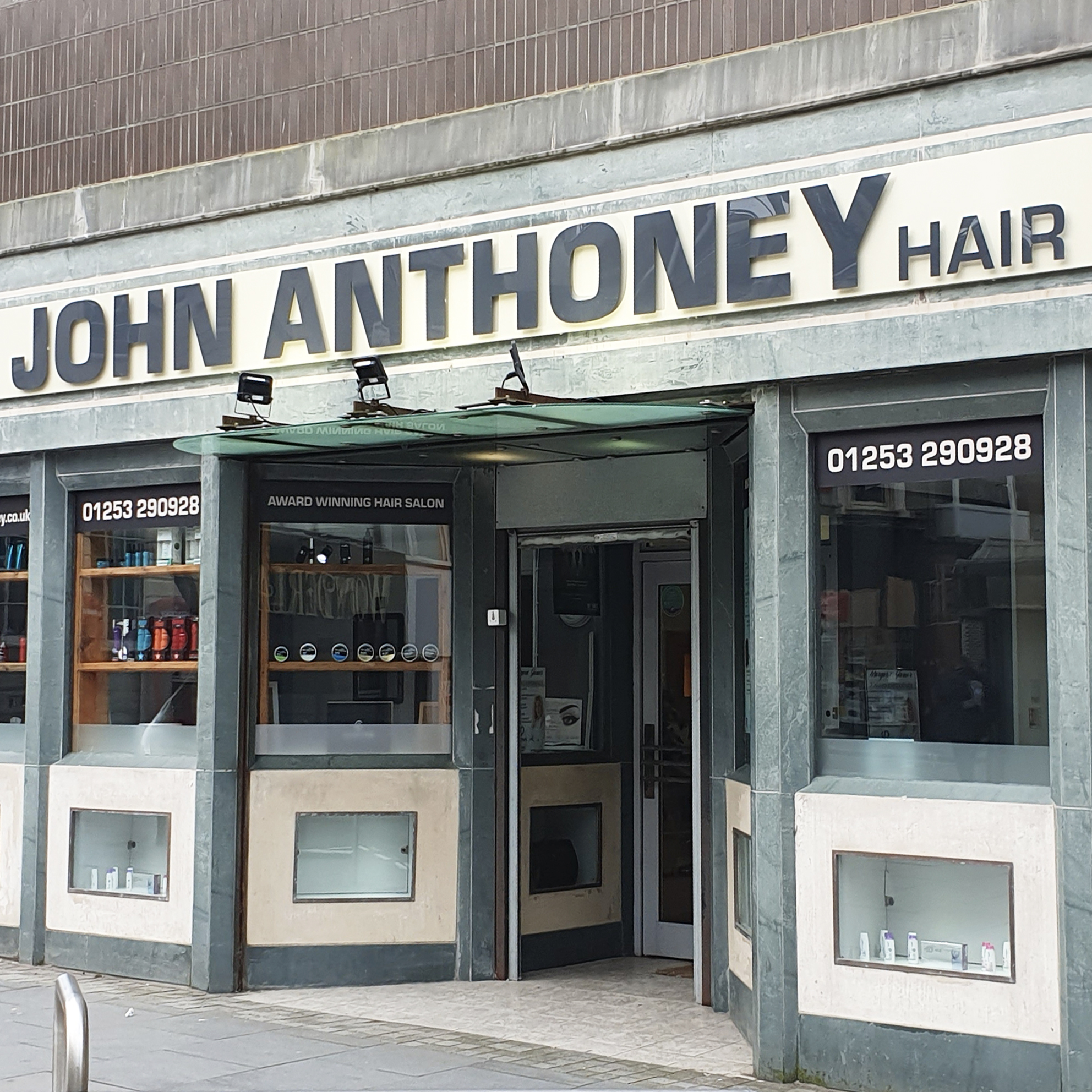
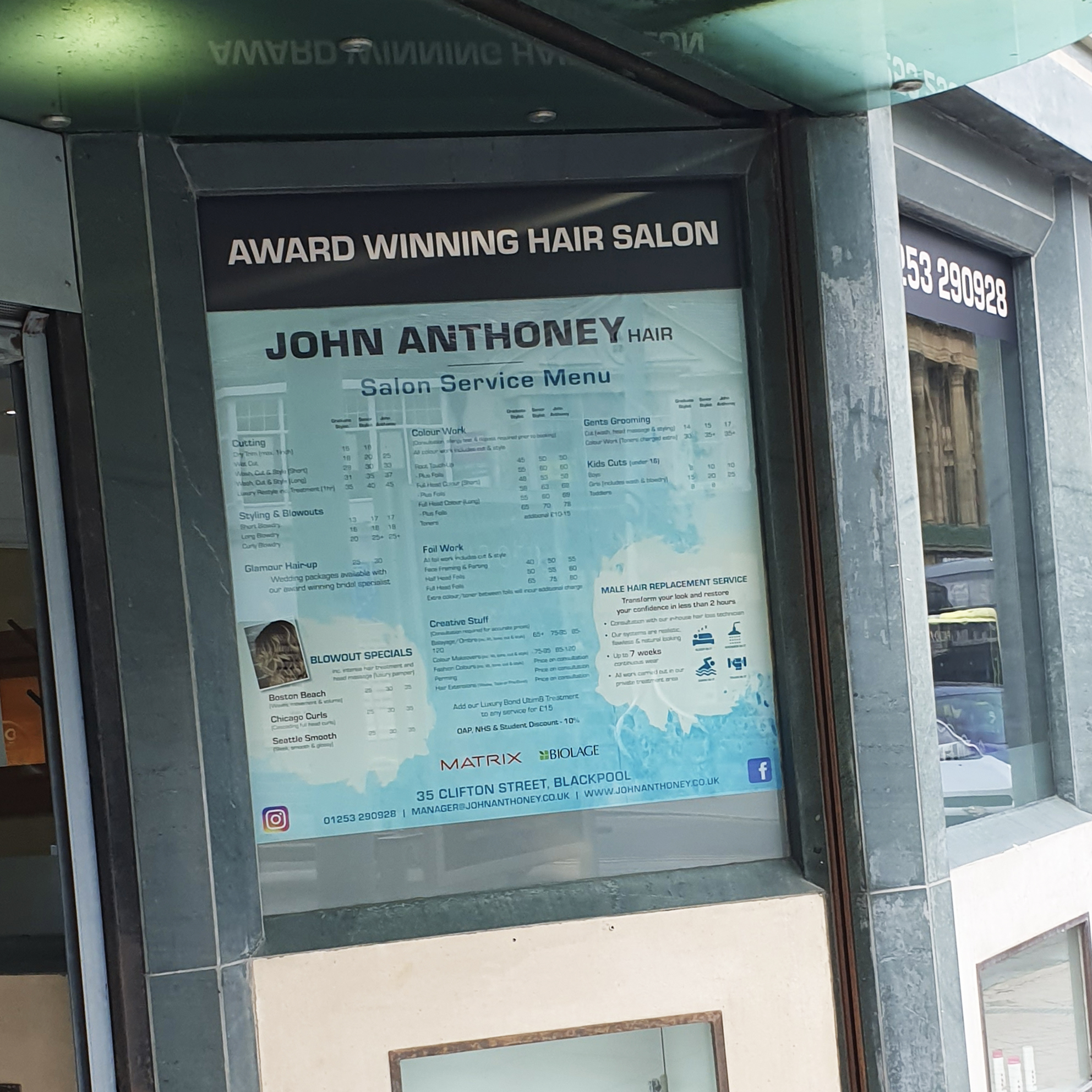
John Anthoney Hair Rebrand
When John decided to relocate his salon into larger premises in January 2019, he decided it was time for a fresh new look for his brand and identity.
Trying to move away from the black and white look he had previously used, it was decided that a more calming, tranquil, spa-like identity would give the new salon a more approachable and friendly ambience.
He also wanted the logo to subtly incorporate his passion for experimenting with creative colour work. The use of the ‘splash’ graphic behind the lettering of his name does this perfectly.
- Corporate Identity
- Website
- Signage
- Marketing Materials
- E-Commerce Shop